Healthline Care Journeys
The goal was to connect readers who trust the Healthline brand with the tools and care they need on their individual health journey while guiding them to products, doctors and services available across our RVO Health brand family. As cookie depreciation fades out, it was important to pivot and find other ways to reach and maintain readership through individual email collection. This is one
of Healthline’s biggest initiatives of 2024-present day which I’m currently help lead on the
Creative Studio side.
The Opportunity
The challenge of this large-scale project was ensuring visual continuity and strong branding across every touchpoint of the 24+ different health conditions called Care Journeys. This challenge also gave me the opportunity to step into a leadership role, driving an organized vision that benefited both my team and the partnering teams involved in the initiative.
Assets that were required to drive e-mail collection expanded over time included:
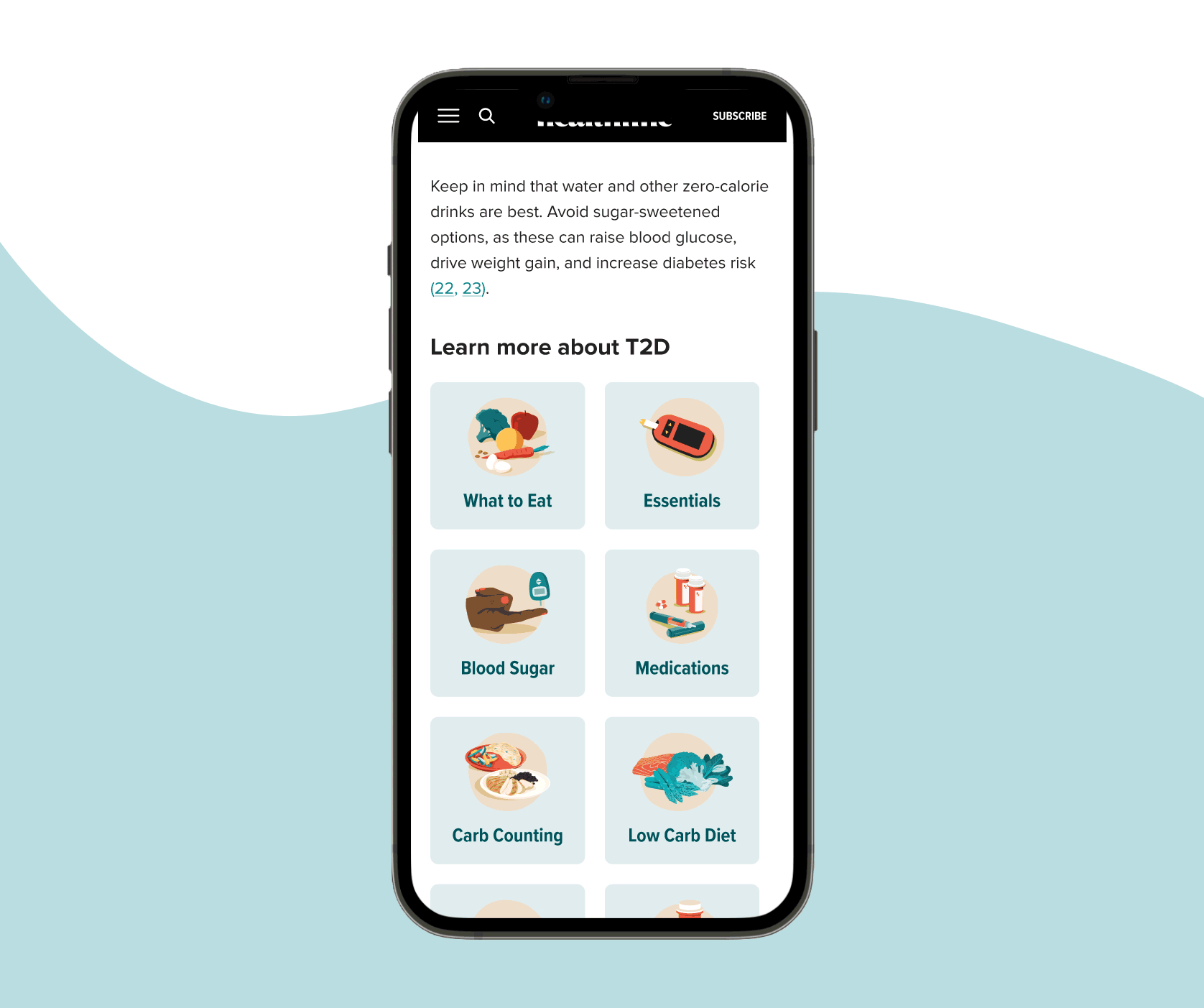
Pathing tile icons found within condition articles and direct readers to other touch-points within their Care Journey experience
Interest questionnaire images found during initial e-mail signup to provide more specific e-mail sends
Condition hub newsletter signup drivers found on the main condition hub pages that direct readers to signup for newsletters
Drivers crafted different imagery and crops for 2nd page pop-up drivers, breakout, and downloadable drivers related to each condition
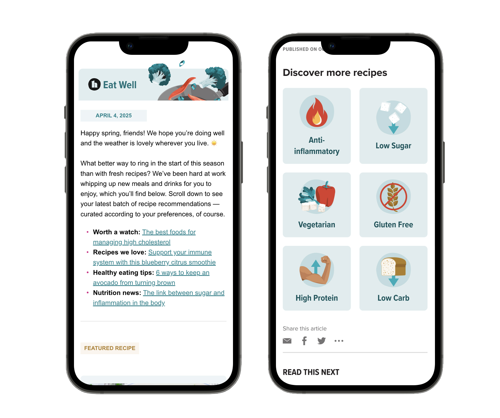
Newsletter banners and mini series needed e-mail banners to welcome new and existing readers for weekly sends
Downloadables print-friendly design resources for specific conditions that would be available to readers who signed up for e-mails
Downloadable social crops promotion for our downloadables that would be used by our social media team
Hub and newsletter thumbnails
Spotlights found on Healthline’s front page that required a more editorial look to bring readers to sponsored content found within the Care Journeys
Youtube gifs thumbnails created from our Youtube content to be promoted additionally in the newsletters
Marketing landing pages separate destination pages designed for traffic coming from social media
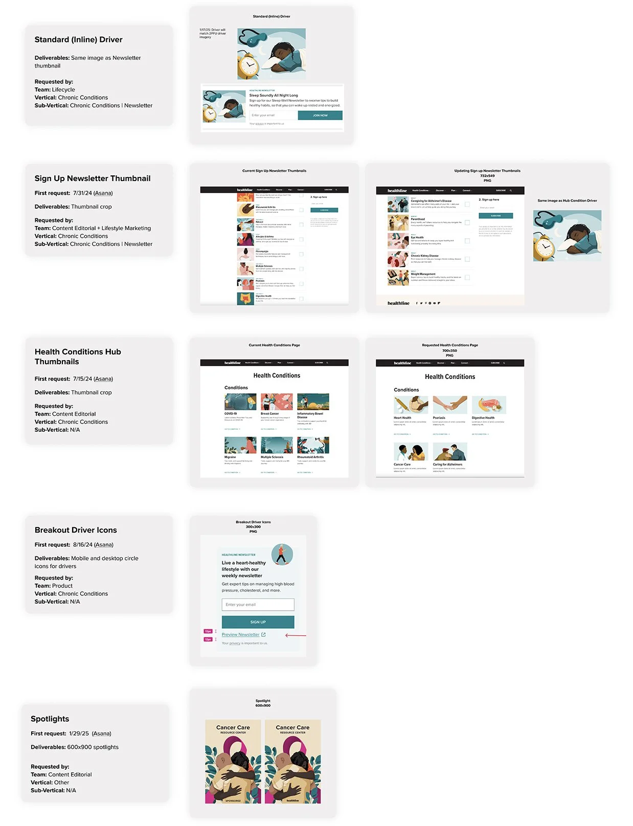

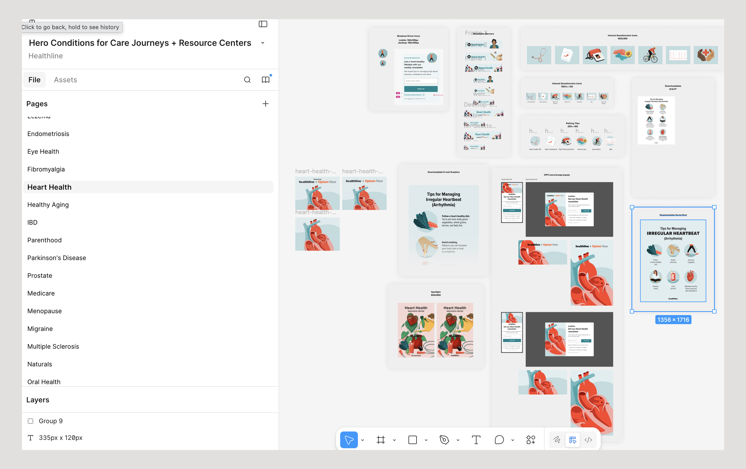
I collected and defined all of the creative requests relating to Care Journeys into a single document. It was important to understand when the requests were made, what team they were being requested by and the deliverables needed. This information eventually led to my visual of a general e-mail capture flow.
Email Capture Flow
Product first developed their own icons for the Care Journey pathing tiles that needed to be redesigned to a simplified image, color and updated design system.
Overcoming Challenges
This initiative required the collaboration across our Creative Studio (my team), Product, Marketing, and Newsletter teams. Due to the scale of the initiative, there was a lack of cross-team communication and no clearly defined stakeholder or understanding of all user touchpoints. For example, Marketing and Newsletter teams would request similar driver designs but not communicate with one another that the need was fulfilled or being tested. This created challenges in alignment and decision-making throughout the project, leading to inconsistencies in overlapping assets and delayed design involvement. As a result, I had to organize and provide open lines of communication to quickly reconcile and produce various elements late in the process to ensure cohesion.


The Approach
I self-initiated the development and organization of the Creative Care Journey board which defined and provided visuals for all requests that were coming in from different teams.
Acting as the main liaison between the Product team and the Creative Studio, I work closely with UX designers and took the initiative to understand their components and engineering constraints. It’s important for me to understand how images live, what constraints are being put into place, and recognize. bugs. By familiarizing myself and collaborating on new components being developed for V2 product designs I am able to better ready my team on requests coming through and have a clearer vision and understanding of how users are interacting with our designs.
By creating this position, I’ve helped place the Creative Studio in a development stage, rather than an end point that allows us to collaborate in real time on solutions, and maintain open communication—ultimately leading to a more unified, efficient process and a stronger, more cohesive brand and user experience.
My collaboration with Maya Chastain ensured a cohesive visual direction, aligning my work and her designs for newsletter banners (left) while seamlessly integrating assets across the site like with pathing tiles (right).

For Hub drivers I needed to consider that the component was built with only 1 upload image size. This image would be set to fill the container and would change based on the screen size (mobile, tablet or desktop) and amount of copy. This variable led to the creation “pattern” design in order to fulfill all possibilities, something that stakeholders normally wouldn’t be aware of or consider when sending in a request.
The Solution
I developed a comprehensive Figma map organized by 24+ health conditions, breaking down each request into categories such as newsletter banners, social posts, pathing tiles, and drivers. This shared, transparent file allowed all stakeholders to easily track existing assets, identify gaps or overlaps across teams, and streamline the design process. It also served as a blueprint for other designers, providing clear expectations and guidance for projects related to the Care Journeys.
Results & Learnings
After defining and designing the on-site branding, internal libraries were created and shared among other designers to use as guides for future Care Journey requested assets that then is approved through me.
This experience has strengthened collaboration between the Creative Studio and other teams, giving us a clearer understanding of company goals and the tests being conducted using our graphics within the Care Journeys. What was once a siloed process has evolved into a more integrated approach, allowing us to make thoughtful design decisions based on user impact rather than solely adhering to brand guidelines. This shift has enhanced our ability to create more effective,
user-focused designs and gained 450k known new users in 2025.
Additional illustrations created by Healthline’s Creative Studio
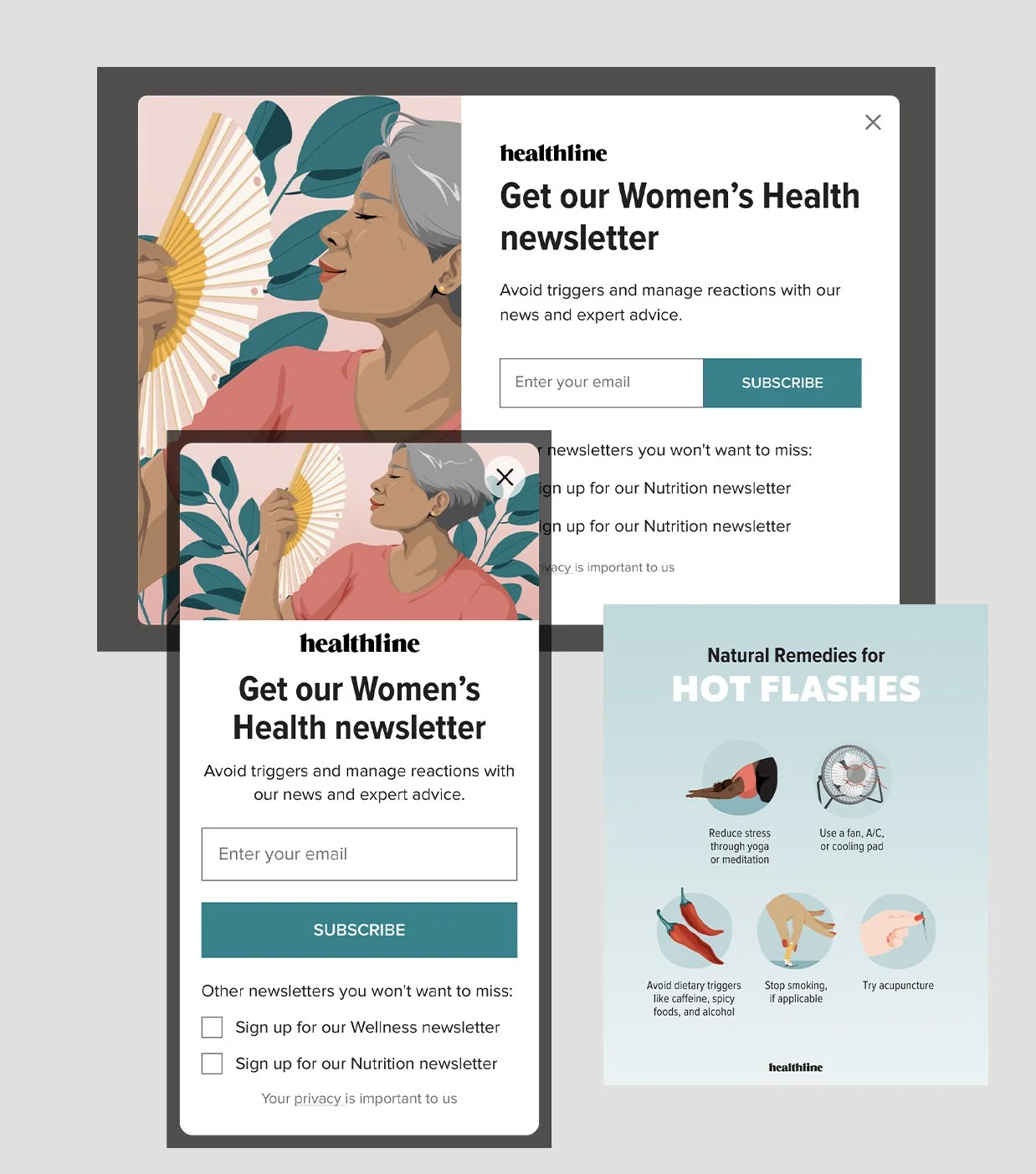
Designs created for the Women’s Health Care Journey for 2nd page pop-up drivers and social