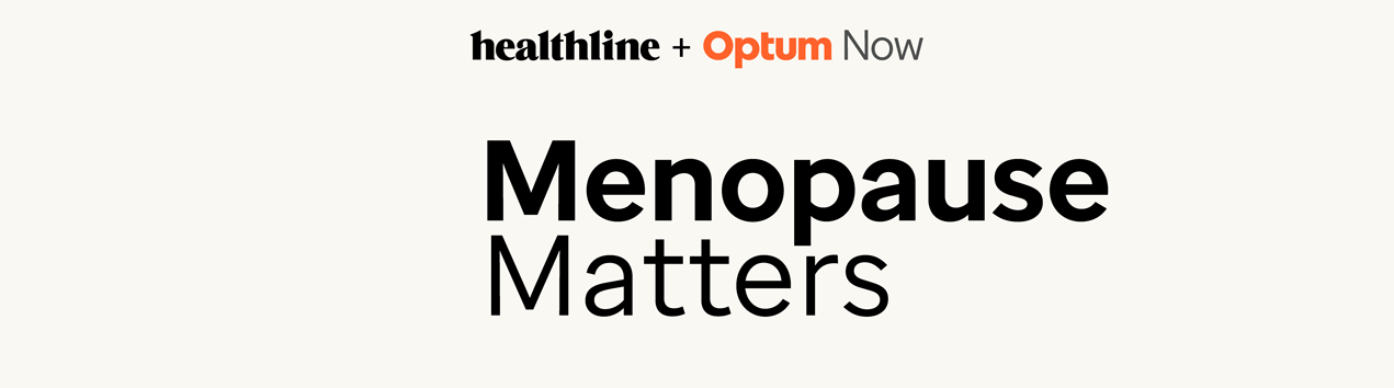
Healthline x Optum Now Unpaused Newsletter
This project centered on developing a flagship co-branded newsletter between Healthline and Optum Now, marking the first of many collaborative initiatives. Titled Unpaused, the newsletter is dedicated to serving our menopause-focused readership. The goal was to develop a scalable, branded newsletter featuring a new color palette, logo, photo design, and modular layout to ensure consistency and flexibility for future campaigns.
The Opportunity
This newsletter is the second-week send for readers who opted into the Healthline menopause series. The biggest challenge was creating a flagship design that felt like a seamless blend of both Healthline and Optum Now, despite their stark differences in color and style—Healthline’s editorial aesthetic versus Optum Now’s more clinical approach in a single week turn-around. The design needed to feel familiar to existing Healthline subscribers while gradually introducing them to Optum Now in a way that built trust.
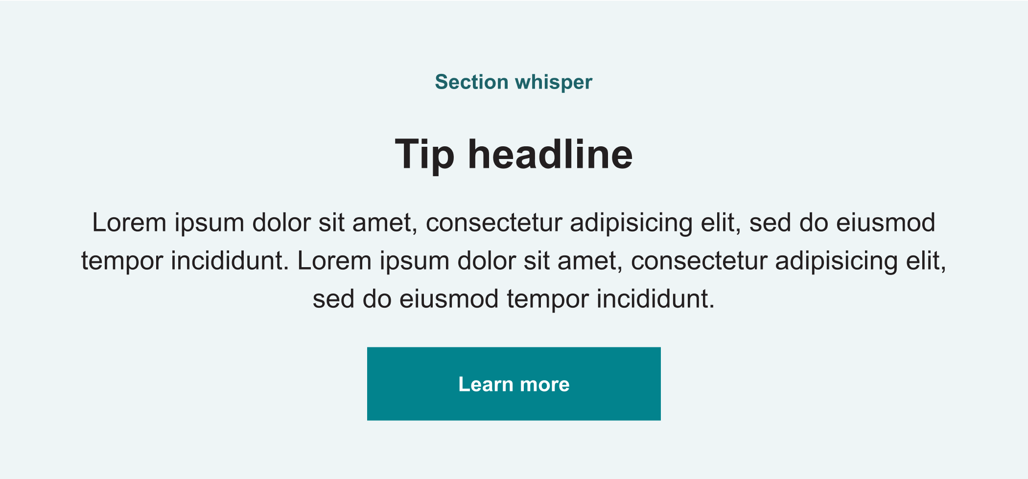
Various components found on Healthline and Optum Now’s e-mails

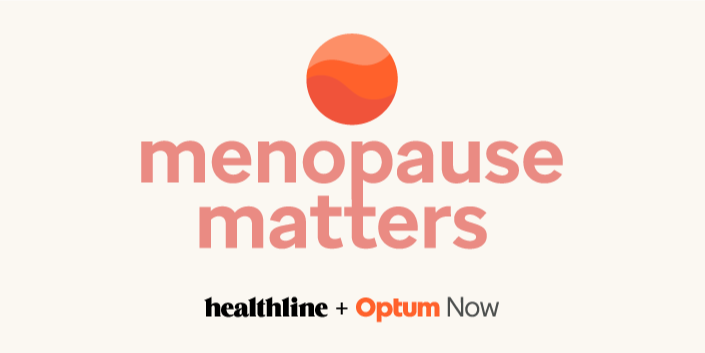

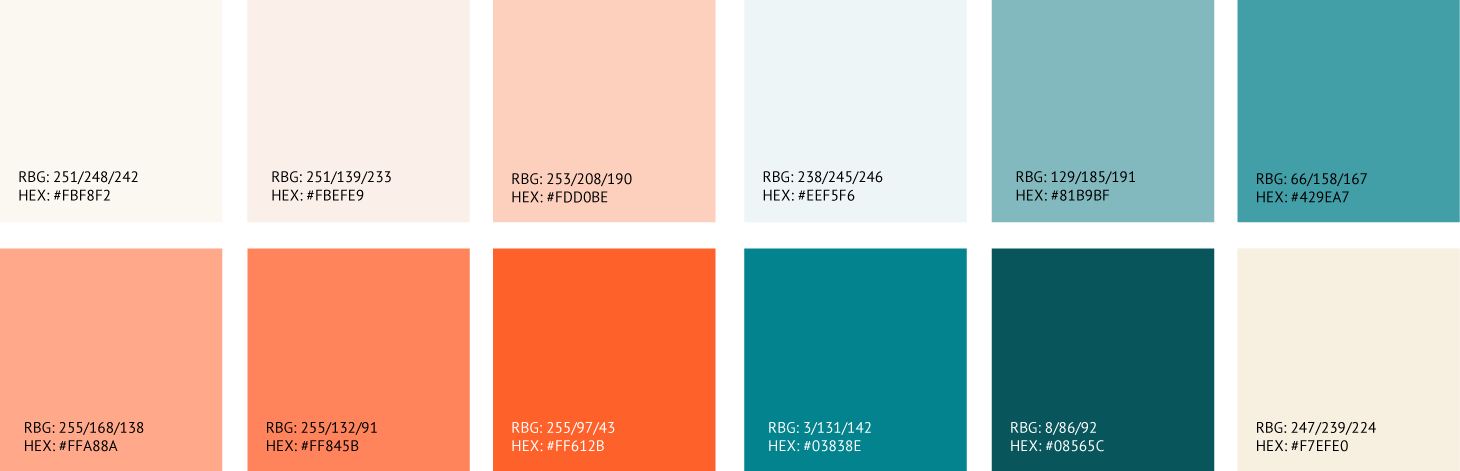
We used a mixed color palette and played with Optum Now’s orange circle design and Healthline’s “wave” along with some playful animation
The Approach
Working alongside a small team of two visual designers, two product designers, one managing photo editor, and one art director, and a name still undecided, we began with individual brainstorming sessions to explore ideas freely. We then came together to discuss initial directions for color, logo, and modular design, identifying reusable or adaptable elements from our existing newsletters. With each iteration, we collaborated in Figma, discussed, refined and evolved the design as a team, bringing us closer to a unified vision for the flagship newsletter.
Overcoming Challenges
The challenge was finding a balance between a fresh, engaging design and maintaining the recognizable identities of Healthline and Optum Now. While we developed strong color palettes that used secondary colors of each brand and logos that suited the newsletter, they initially strayed too far from the core brand aesthetics, risking confusion for readers. Additionally, we needed to ensure the design was scalable, allowing for future topics beyond menopause. By identifying these concerns early, we adjusted our approach, keeping the reader experience at the forefront to create a design that felt both familiar and adaptable.


The Solution
I created the gif logo that combined Optum Now’s original logo and color with Healthline’s cyan, incorporating a rising sun motif to represent the new life stage women go through during menopause. This design balanced both brands equally, maintaining a sense of collaboration without one overpowering the other. The color palette remained soft and approachable, particularly in the modules, and we created flexible color options for each. To maintain brand cohesion, we included photo collage elements inspired by Healthline’s style and introduced varied shapes for widgets, making sure the overall design remained unified across all touchpoints.


Alternative colored components were developed to create variety for future sends, warm white and cyan. Separate mobile and desktop designs were created along with guidelines and dev specs,
Team: Myself, Maya Chastain, Ruth Basagoitia Machuca, Jaime Keiter, and Regina Ahn
Results & Learnings
Reach: 11.4K US users (20+K globally)
Open Rate: 37.3% (+4.7% vs. industry average)
Optum Now Sessions Driven: 1.2K
This was the first exploration between Healthline and Optum Now, developed over the course of one week. The tight turnaround required close collaboration, with our team working simultaneously on a shared Figma board—brainstorming, splitting off to develop individual ideas, and reconvening to review and refine our visions. This process highlighted our ability to effectively communicate and collaborate under pressure, allowing us to meet the tight deadline while ensuring the design was aligned with both brands.